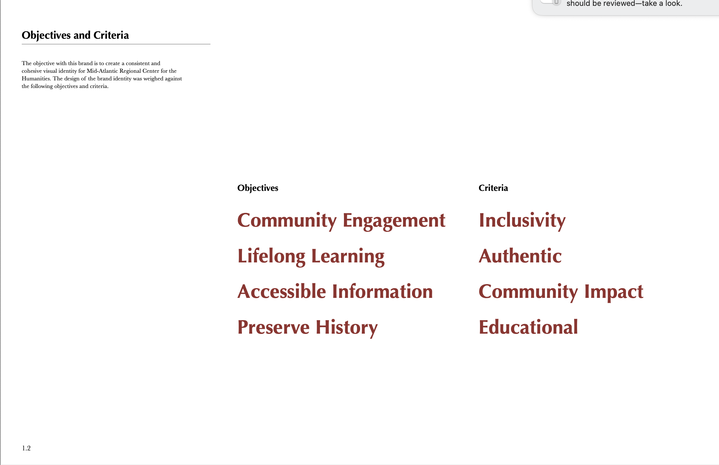
MARCH Re-branding
The rebranding of the Mid-Atlantic Regional Center for the Humanities (MARCH)—a department within Rutgers University—was an effort to establish a fresh visual identity that aligns with its mission and values. The objective was to develop a logo that meaningfully represents the themes of community, history, and nature.
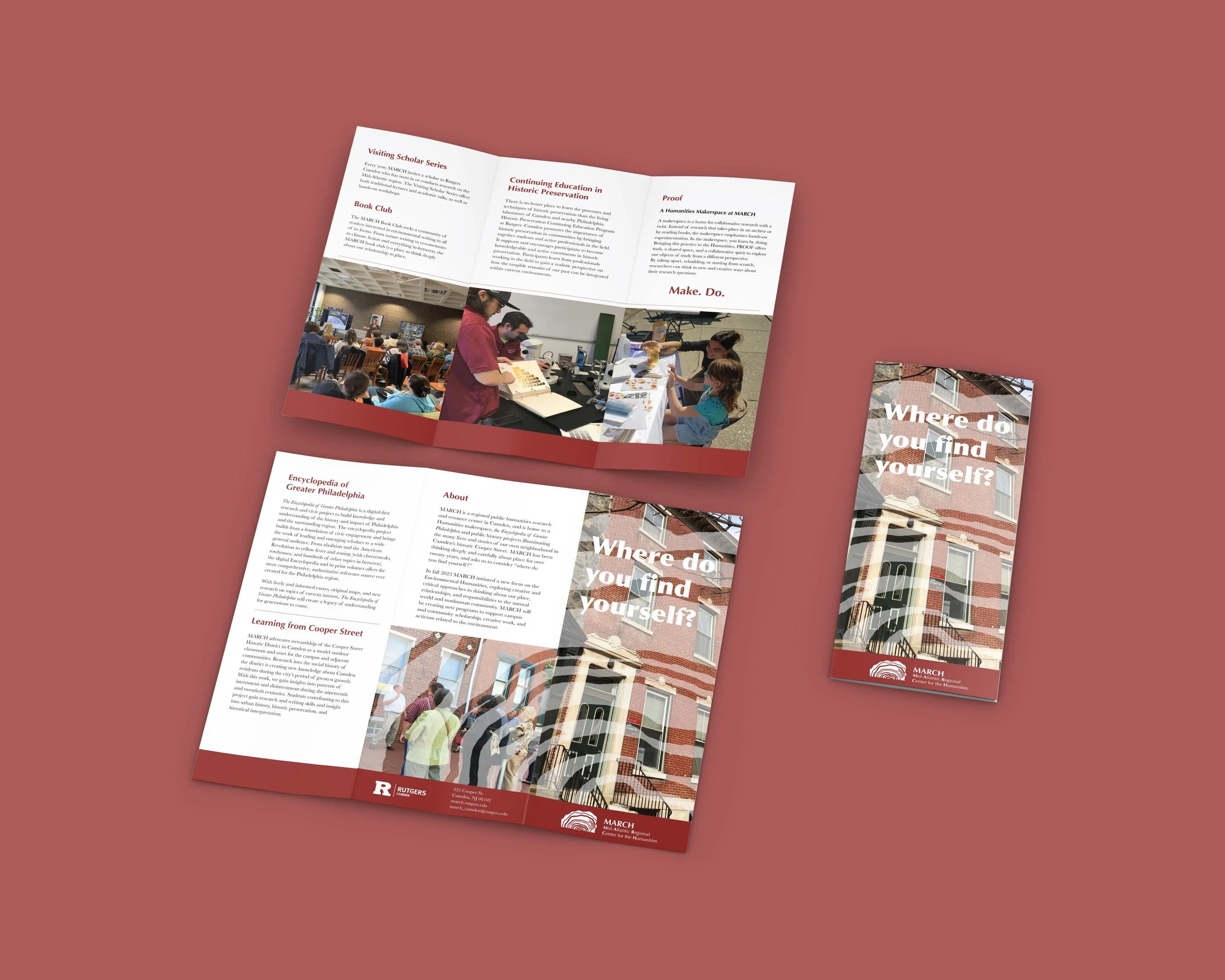
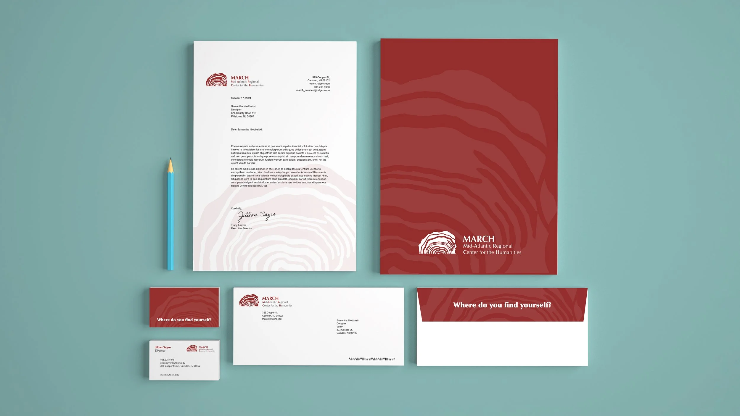
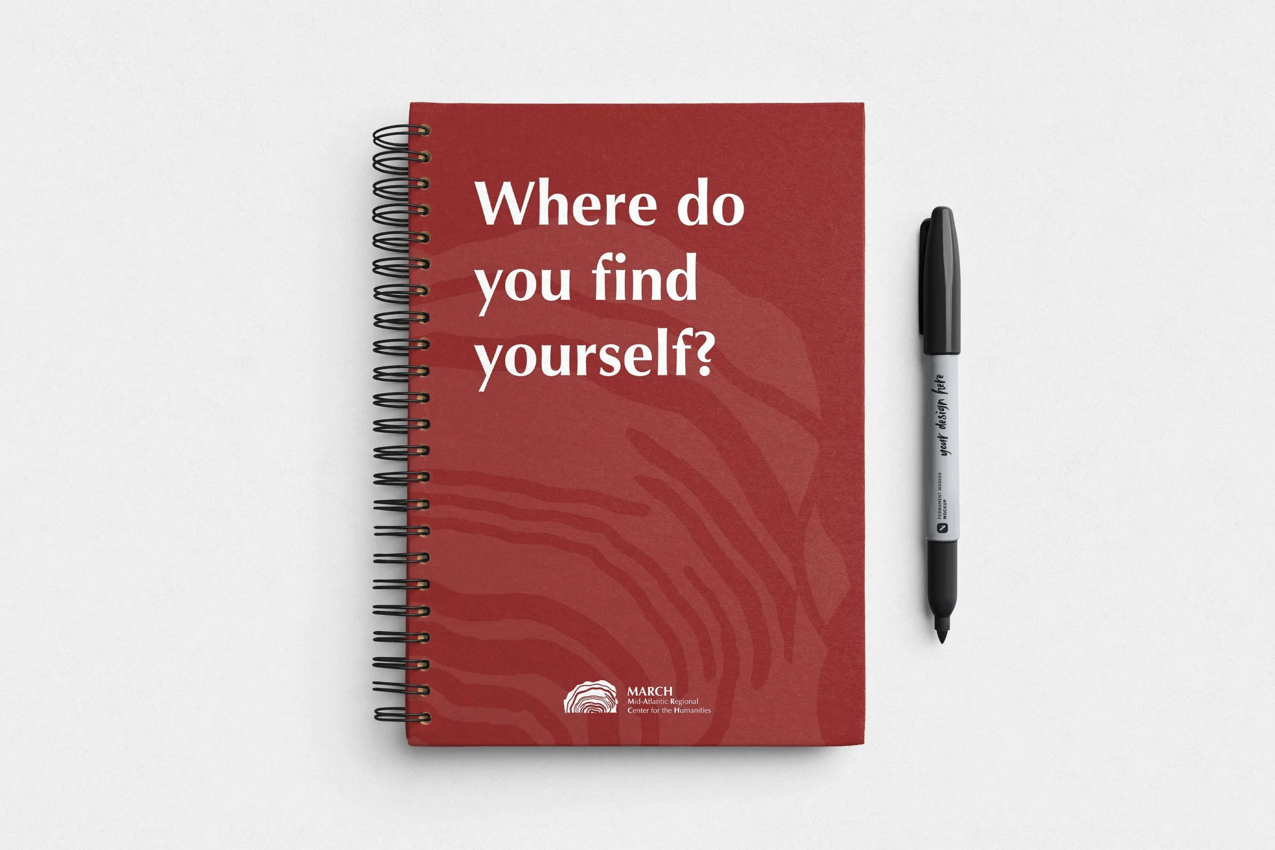
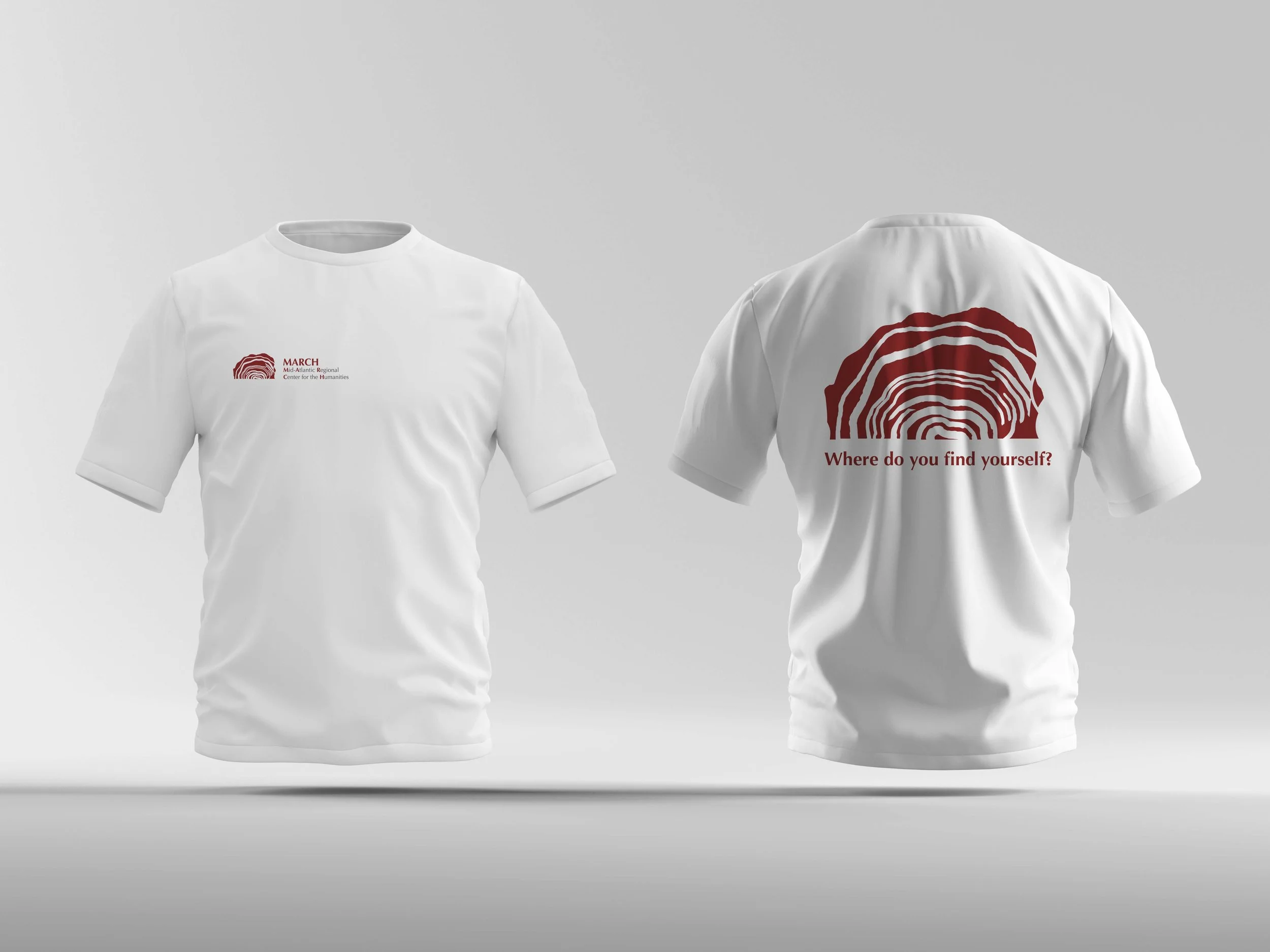
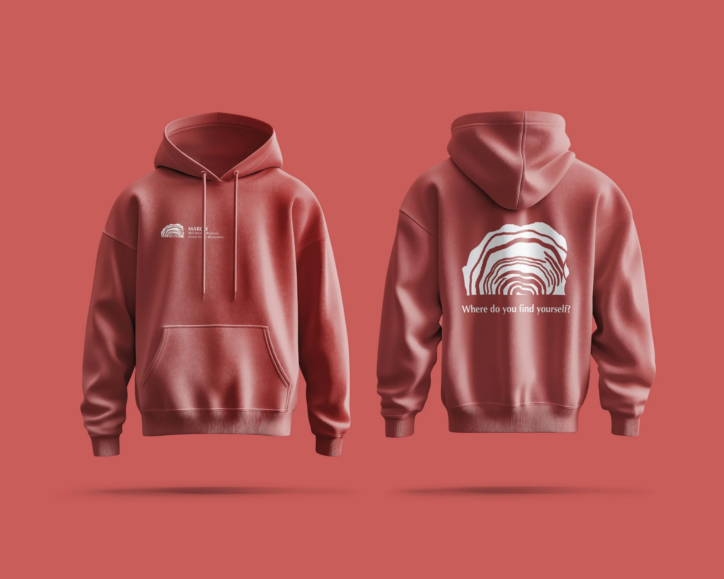
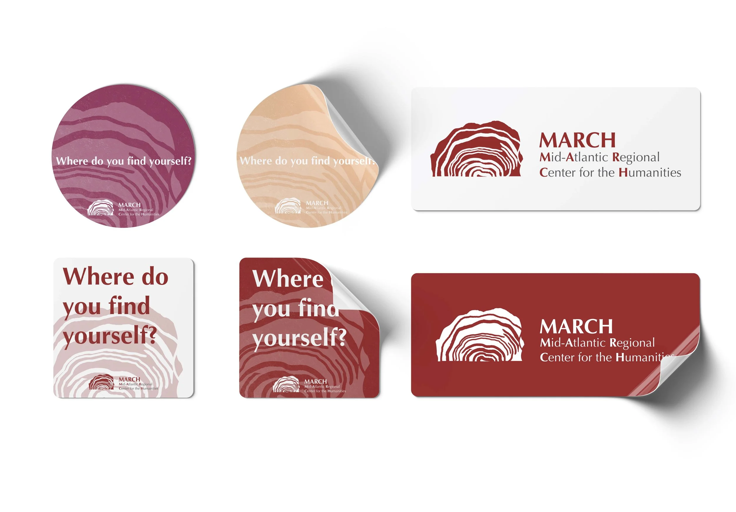
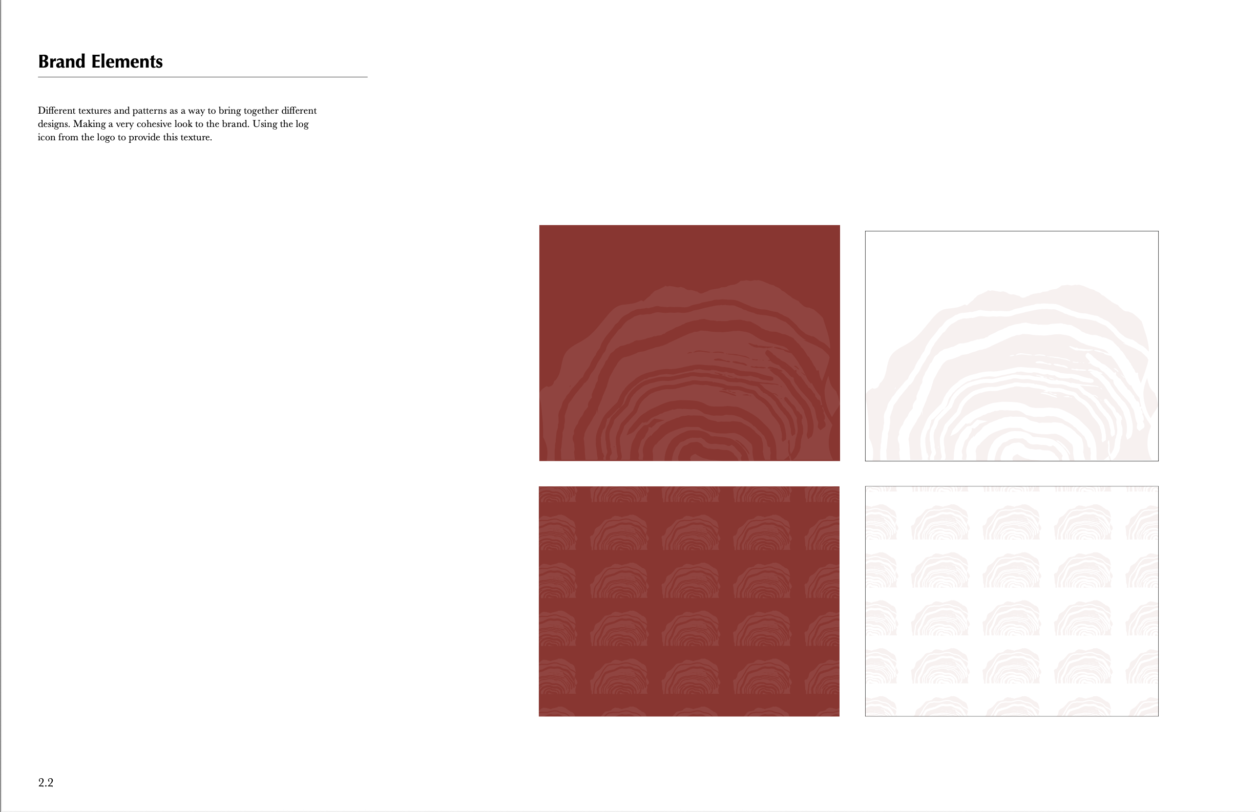
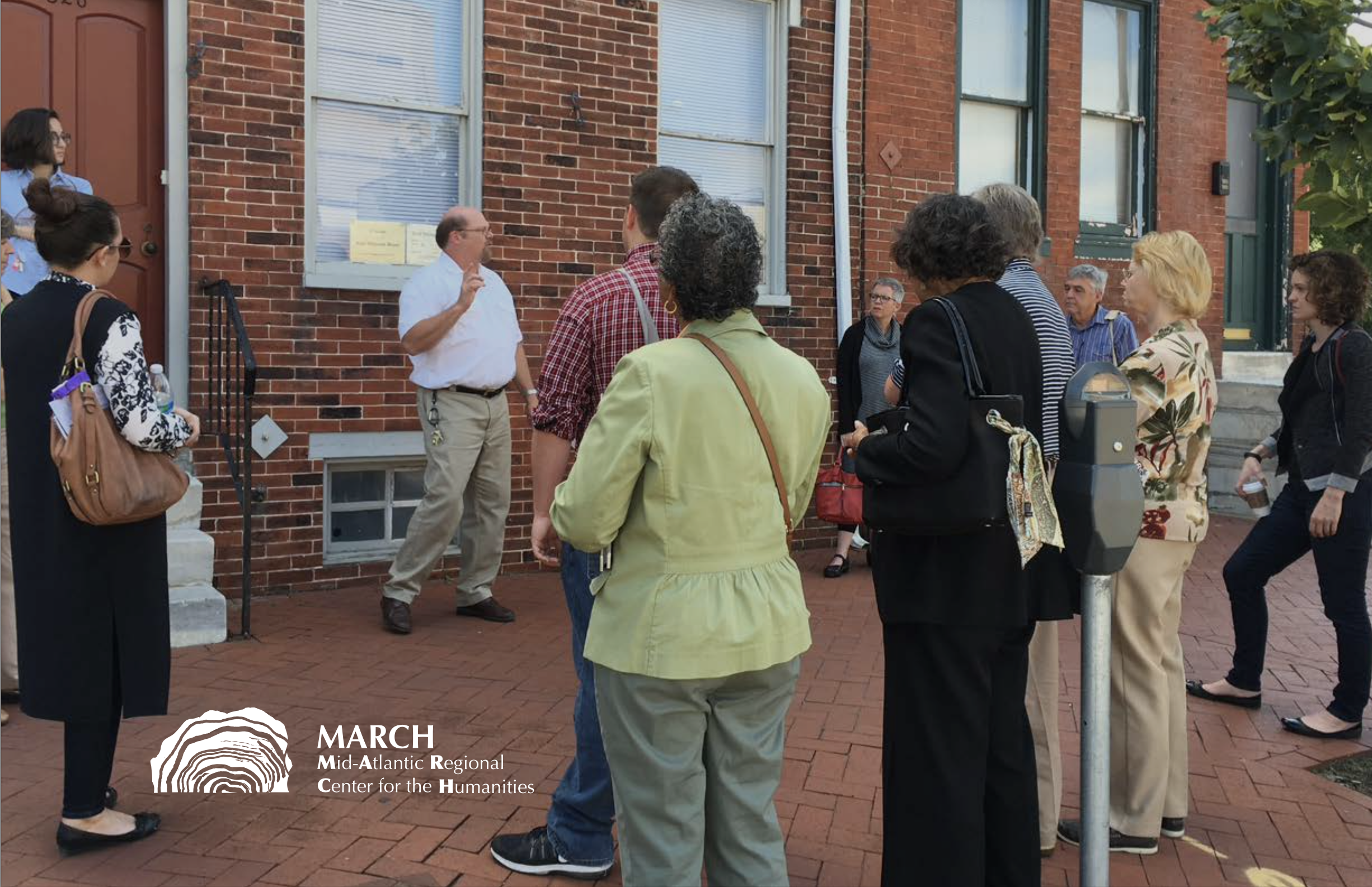
The final concept was inspired by the image of a log, chosen for its symbolic significance: tree rings represent the passage of time and history; the tree itself stands for nature; and its icon reflects the idea of shelter and community gathering.
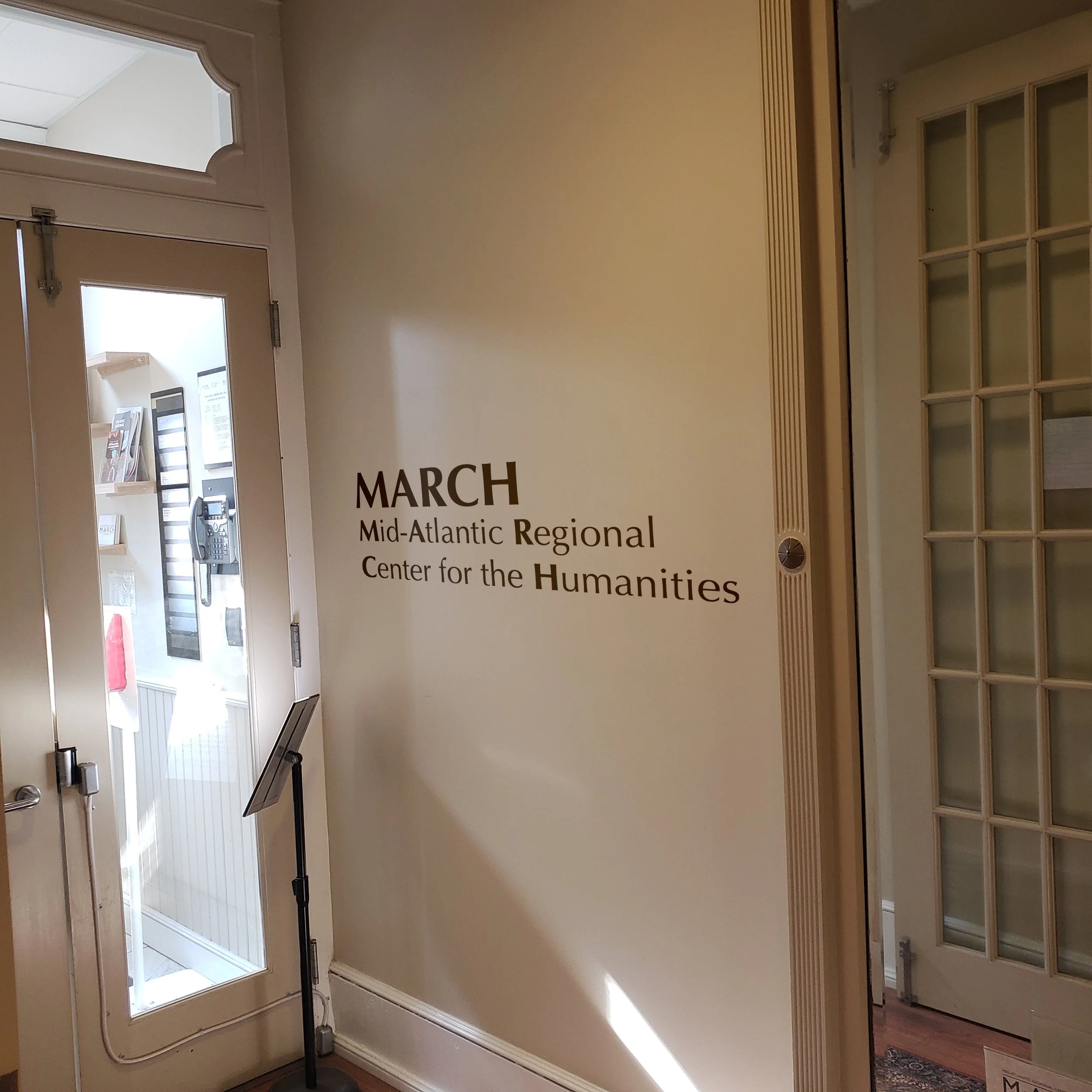
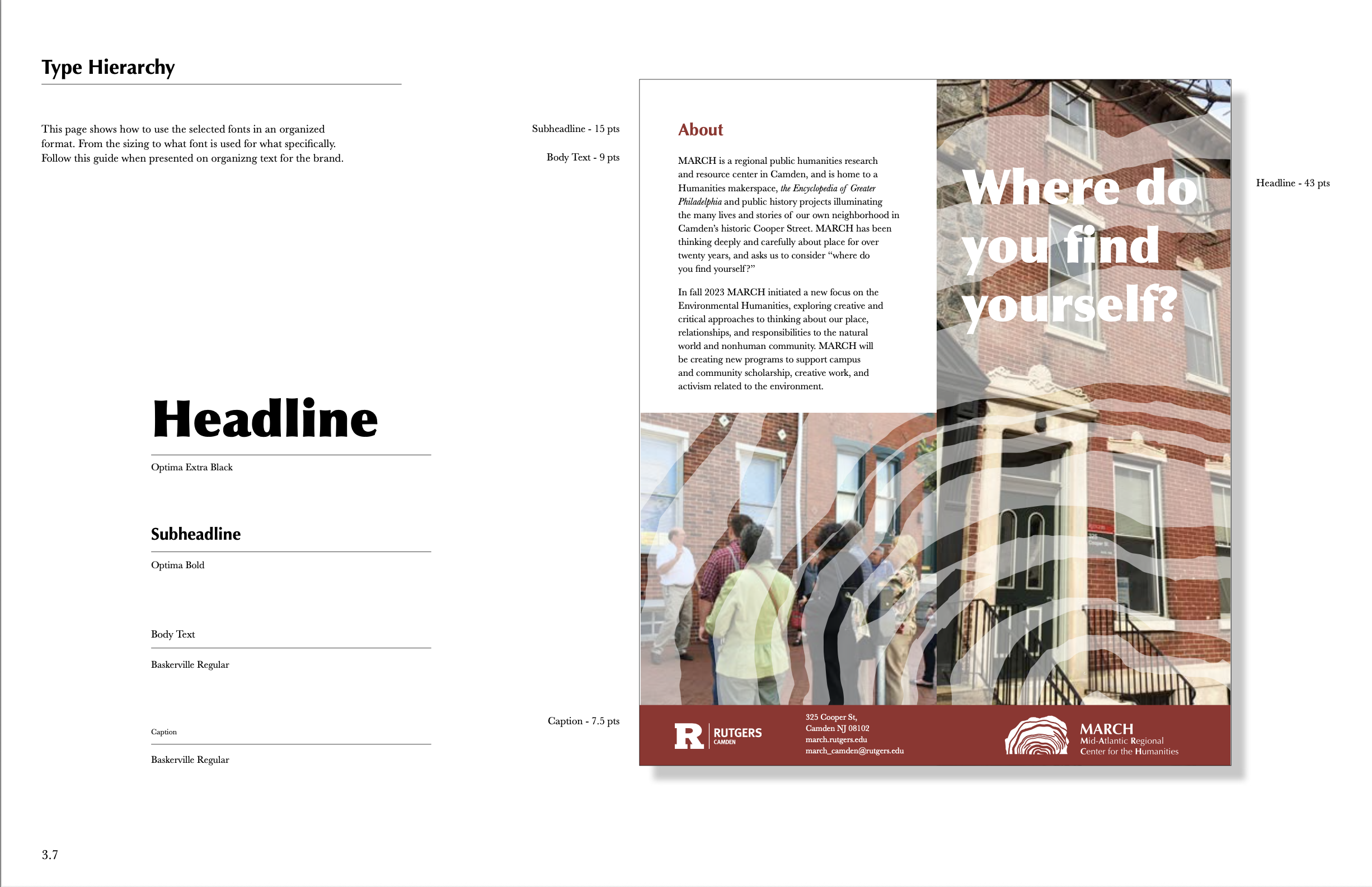
Typography also played a key role in the rebranding. Special attention was given to visually differentiating the acronym MARCH from the calendar month, ensuring clear and immediate association with the department.